the hope center
/ branding /
ROLE: Creative Direction,
Design, Copywriting
The Hope Center is a community hub offering services and resources to support individuals and families facing challenges.
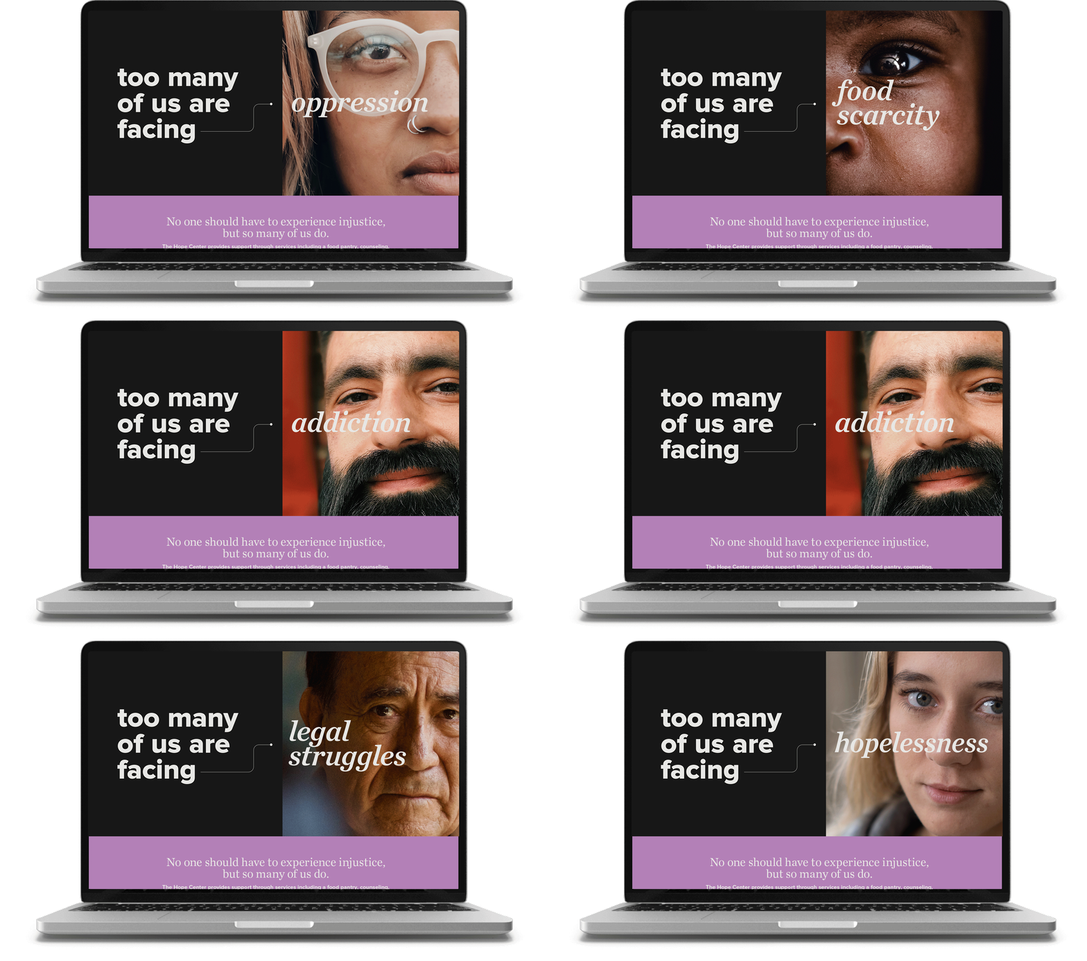
The brand uses warm, approachable visuals to reflect a welcoming, non-judgmental space. Thin line connectors are used throughout the visual system to signify connection and moving toward a solution.
Collective Purpose
The logo is comprised of five dots uniting—representing people gathering around a shared mission.
The negative space in the center is an implied safe space / building — showing that Hope Centers can exist anywhere people come together to serve, regardless of any single physical space.
brand system
The Hope Center brand was strategically designed with room to grow. Distinct sub-brands like Hope Foster, Hope Farm, Hope Legal, and Hope Food Pantry were each given a unique accent color and a custom text lockup within the parent brand system.


